Paladins of the West Kingdom is the follow up game from Garphill Games in the West Kingdom Trilogy. In Paladins, you will be managing your faith, strength and influence in order to defend your kingdom, appoint Monks, and spread faith throughout the kingdom, all within 7 rounds!
1 – 4 Players | 90 – 120 Minutes | Designed by Shem Phillips &
S J Macdonald
The game was initially released through Kickstarter, which included some promos for the game and the option to upgrade to metal coins, however I already have metal coins for Architects of the West Kingdom, so I didn’t think I needed 2 sets. The game is available to buy from the Garphill Games website, and is also available for pre-order on the Renegade website.
Box Design
The box is the same size as the other games from Garphill (e.g. Architects, Raiders of the North Sea etc.) and features a beautiful matte linen finish. The artwork is striking, and I find that the title and other text/logos are really nicely balanced to do not detract from the background at all.
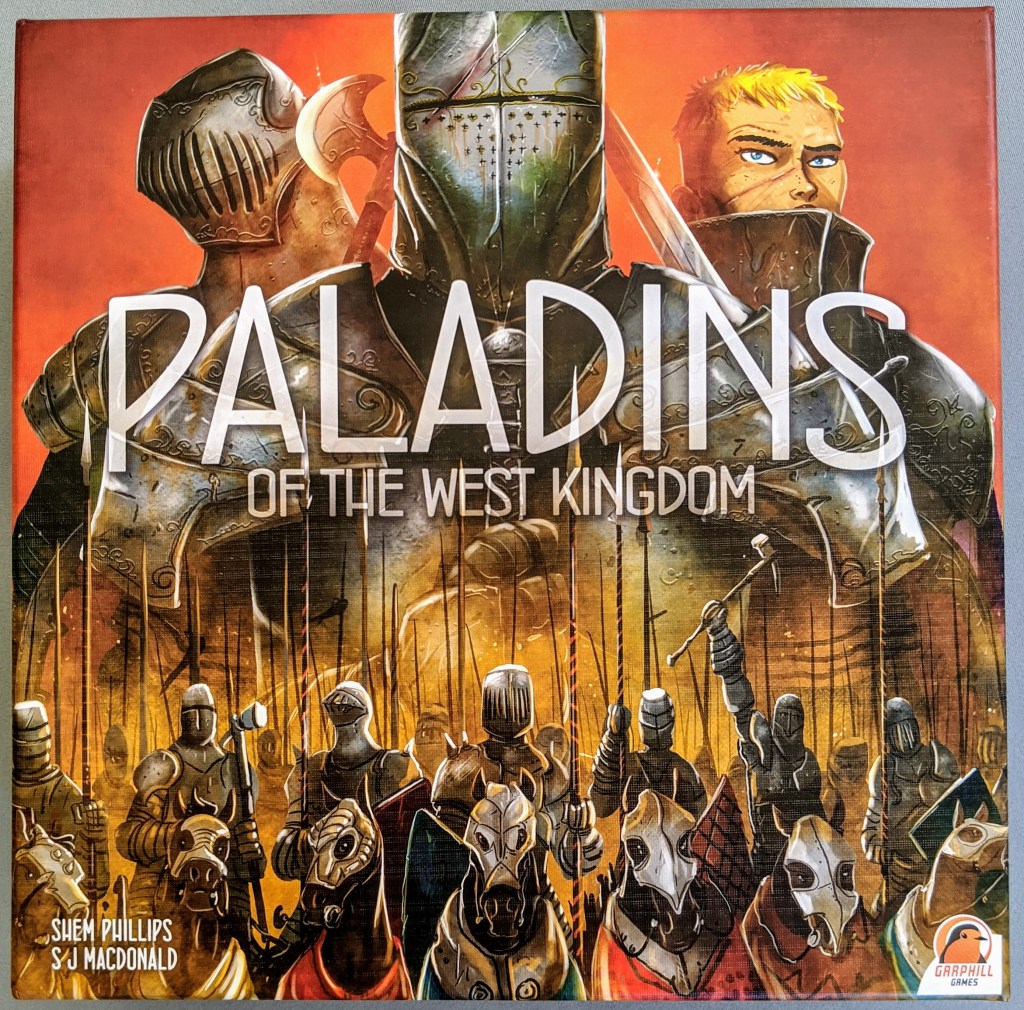
I love that the cover of Paladins reflects the Architect’s box perfectly, with 3 main figures at the top, and a larger image below the title to showcase what the game might be about, in this case protecting your kingdom from incoming enemies. Architects also contains 3 large figures in the top third, and an image of the town’s cathedral is the hero image, which is a key in-game element you will be working on. I am keen to see the what the next game will entail!
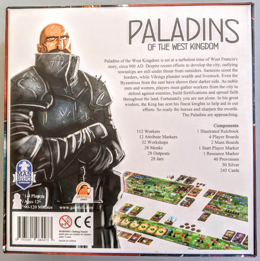
The back cover is not bad, and I love it when the game is shown during play on back covers. In this case though, I find that the hero character is perhaps too large and distracting, and the flow of text outlining the components seems strangely aligned. If the hero were smaller, there would be more room to showcase a larger, more clear gameplay image. I also think the barcode/warnings are in a position which draws attention to them, which I feel is unwanted. It is the same colour as the background, so I wouldn’t have put it on the black background as it makes it stand out.
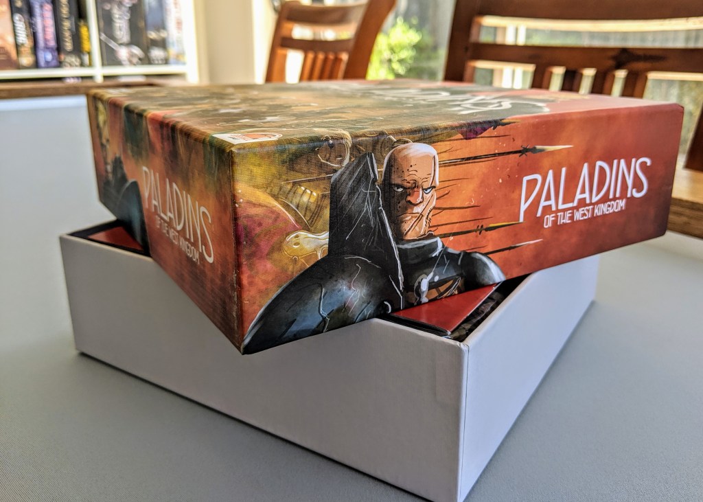
The box and it’s lid are both really nice and sturdy. Different artwork is showcased on each edge of the lid, but once it is removed, it is just a white internal box, which is fine.

Rulebook
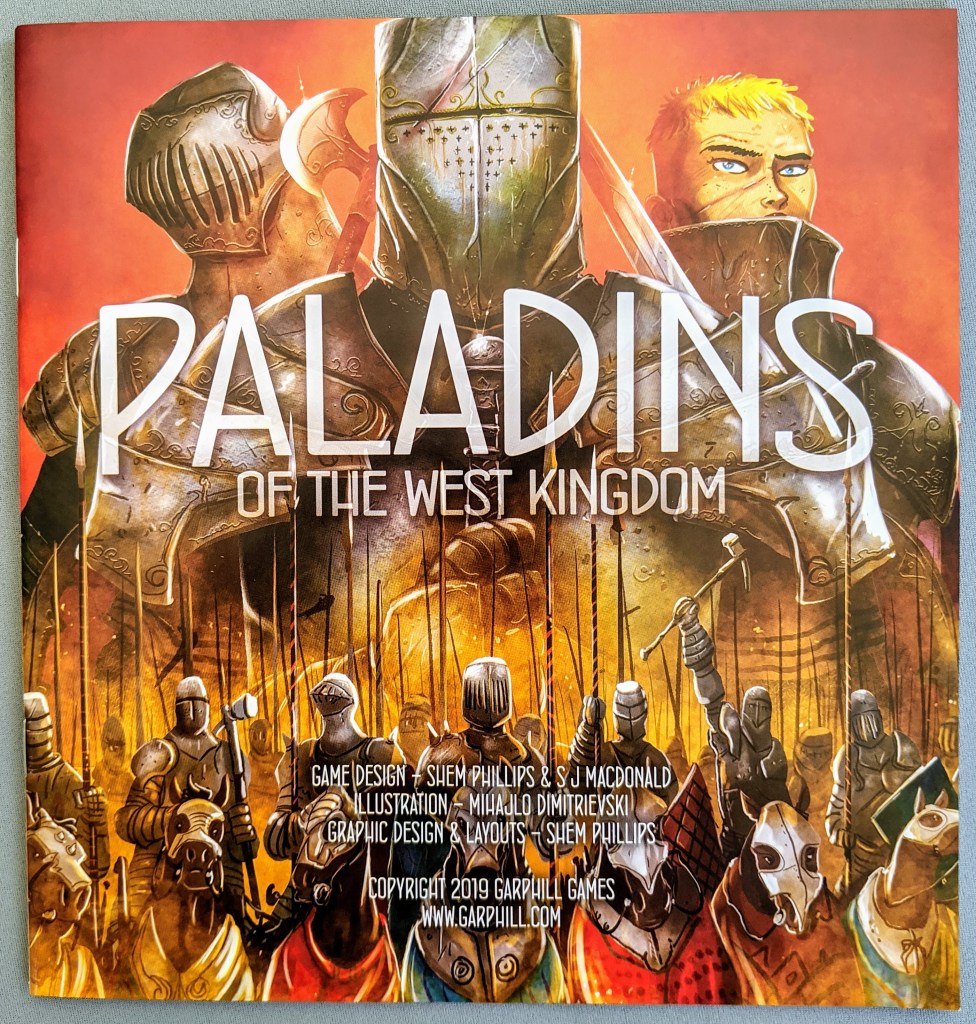
The cover of the rulebook matches the cover of the box, with some additional text credits neatly added as well.
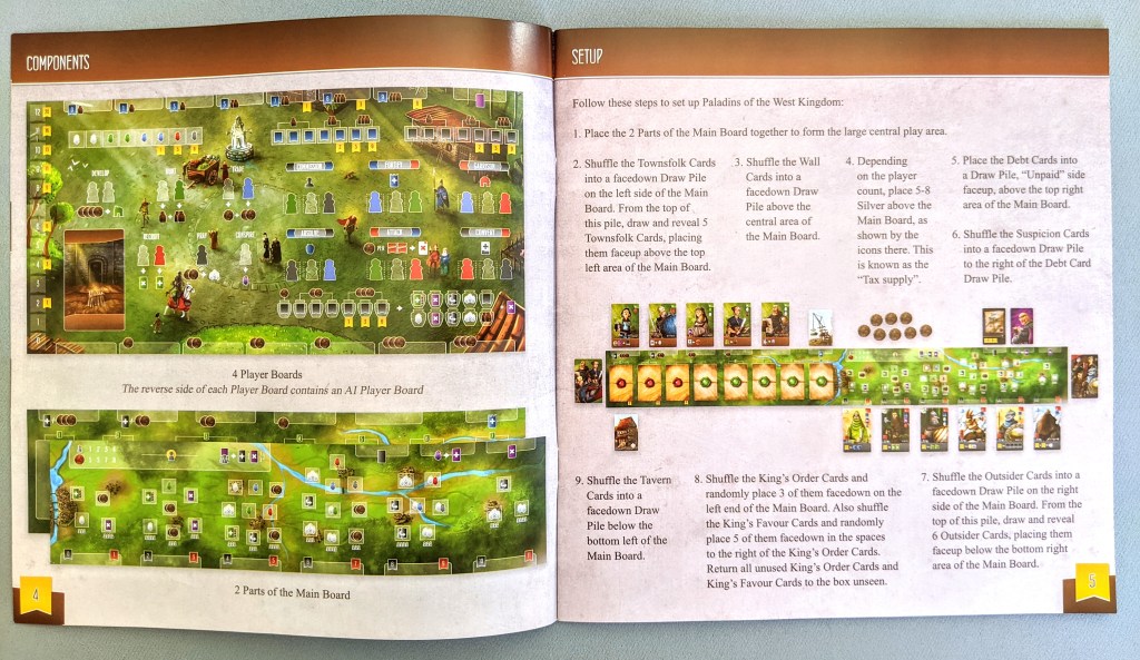
The set up pages are very clear and feature a lot of different image examples to assist set up as there are multiple different boards which some may find confusing. These pages are laid out neatly in a similar graphic design style to other games from Garphill. I don’t know if it is normal, but my rulebook seems to be stapled in a way which makes it sit quite weirdly, but it is not a huge issue.
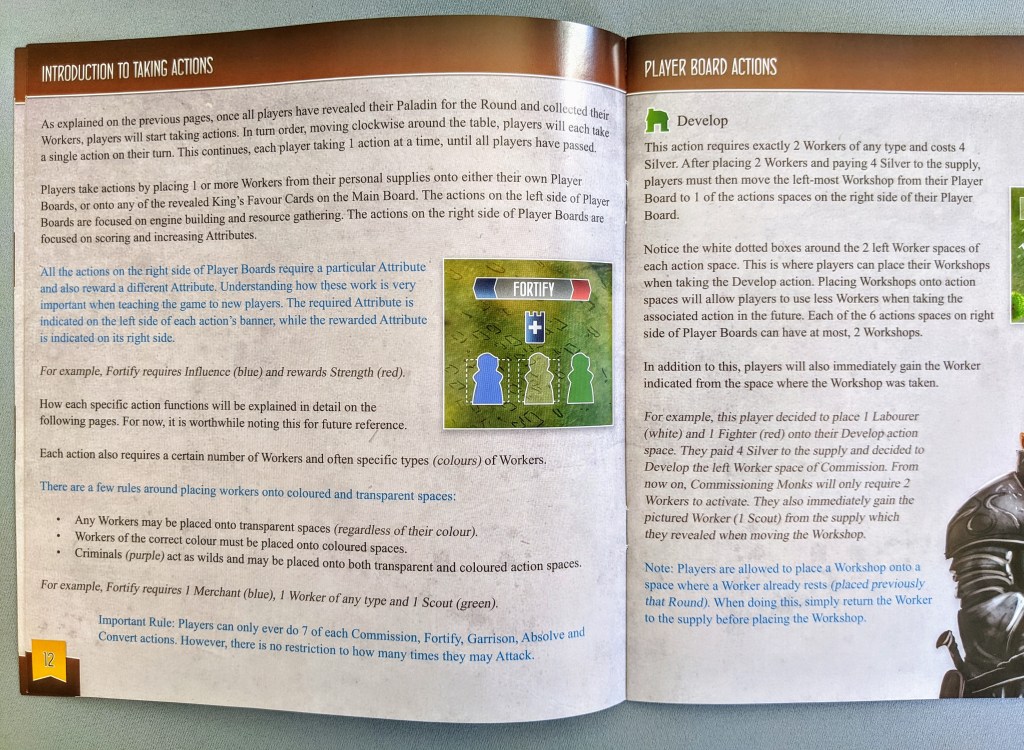
All of the actions are explained really thoroughly, and the rulebook is actually quite thick. I didn’t find it that difficult to learn the game, and I really like how key points throughout the rules are highlighted in blue text to draw attention to them.
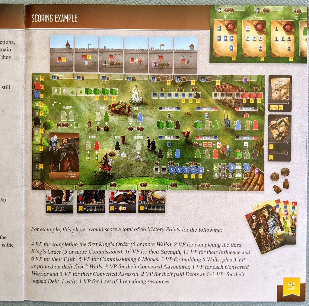
The scoring example in the back is super helpful, and runs the player through exactly how any points are scored using a large example image of a player’s board so you don’t miss anything.
The back cover contains a quick reference of all the symbols in the game, which contain similar iconography to Architects, so if you have played that, it won’t be too hard to work out the icons.

Components
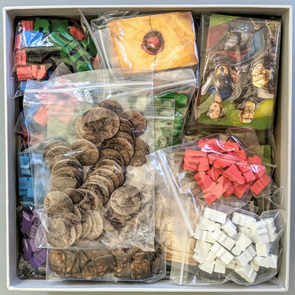
This box is FULL. There are so many wooden bits, and also so many boards!

The same artist has worked on this game as with other Garphill games, with a whole heap of beautiful card artwork which gives all the characters a really familiar vibe.
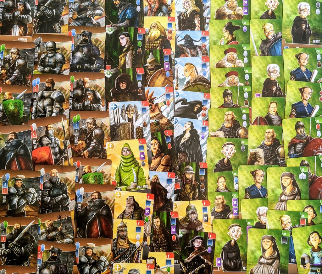
The game has a lot of cards! They are a really nice thickness with linen finish. Unfortunately my cards are already starting to warp a bit, but I think that is just pretty common in Australia when I open any game.

The coins and provisions are just cardboard, but I can always add the metal coins from Architects. This game is quite different in that there are no player colours, just a main supply of coloured meeples which is cool.

Below is a sample of what each player receives. Again, no player colours, everyone gets the same thing.
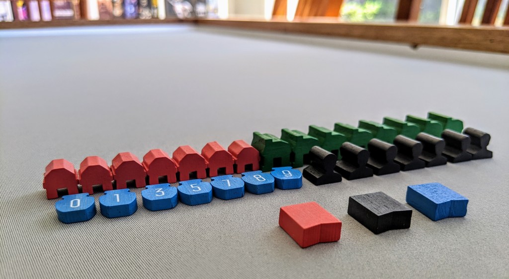
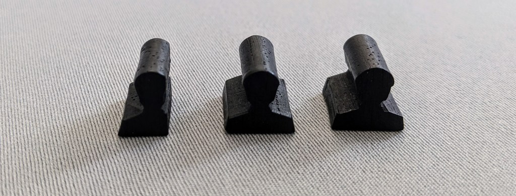
All the wooden bits are really cute, and I like how there are custom shaped items instead of just using cubes or something. My only issue is that one of my Monks is missing some of his body! Poor guy…
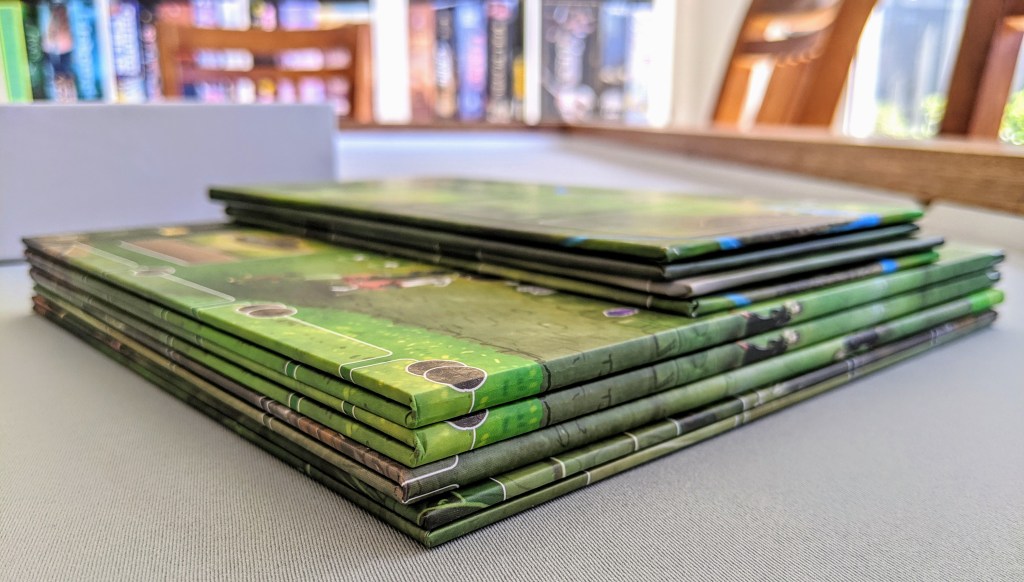
Game Boards
Look at this stack of boards! Each player gets one of the larger boards, and the 2 smaller ones go in the centre of the table.
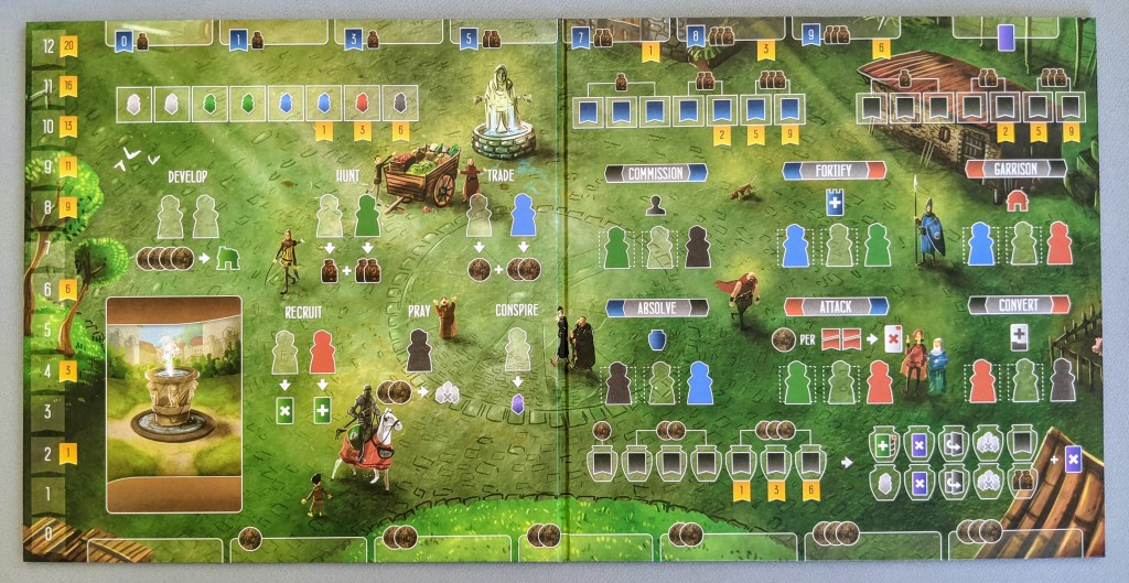
The player board shown below can seem a little intimidating at first, but once you learn the game, the layout is really clear and simple. There are a lot of icons, but they basically just outline where certain meeples go and I think the boards have been really cleverly designed. I also like how there are cute little details in the background artwork as well, such as a little pig, and different characters in your kingdom. Each board also shows a different ‘deck of cards’ image, which reflect the individual player deck which is a nice little touch.
Below is an image of the central boards, which house the ’round tracker’ cards, and more worker placement options to gain rewards.

All the boards contain this unique thicker fold line which I haven’t seen in any other game (that I can think of!) which allow the boards to lay completely flat which is really cool!

Insert
I think the game had a folded cardboard ‘insert’, but I had to throw it away as there is ZERO spare room in this box! It is packed to the brim with baggies! If you had the metal coins as well, it would be pretty hard to fit them in the box.
Thoughts
Overall, I am always impressed with the quality from Garphill Games. Things aren’t over-produced unnecessarily, but everything is always good quality. Even though the box is overflowing with components, none of it is ‘Kickstarter Exclusives’ or random ‘Stretch Goals’, just nice things for a great game.
The artwork is amazing, and I am always happy to commit to any game which Shem makes as I know he puts so much effort into making good quality, think-y games.
My only small complaints are the box size, which could be a bit bigger, and my poor, poor Monk… RIP!
