I don’t really like jokes about unrefined oil…
They are too crude for my taste.
2 – 4 Players | 60 – 120 Minutes | Designed by Ryan Courtney
Ok. Following that terrible joke, we can move onto unboxing Pipeline!
Pipeline has quickly become one of the most talked about games of 2019 after flying a little under the radar during it’s release on Kickstarter in late 2018. Now that the campaign has been fulfilled, it seems everyone is talking all about it! The kickstarter didn’t offer too many special upgrades to the game except for a metal cubes upgrade, so grabbing a retail copy won’t matter for this game.
Box Design
I think this box art is one of the most stunning covers I have ever seen. The art style is mesmering and the graphic design is flawless. I cannot fault this cover at all.

The artwork of the port is matched beautifully with graphics which clearly represent what the theme of the game entails, with pipe mazes intertwining throughout the lower half of the box. All the colours work really well together so nothing takes away or detracts from anything else.
Gah look at that crease! …It’s ok… I’ll be ok…
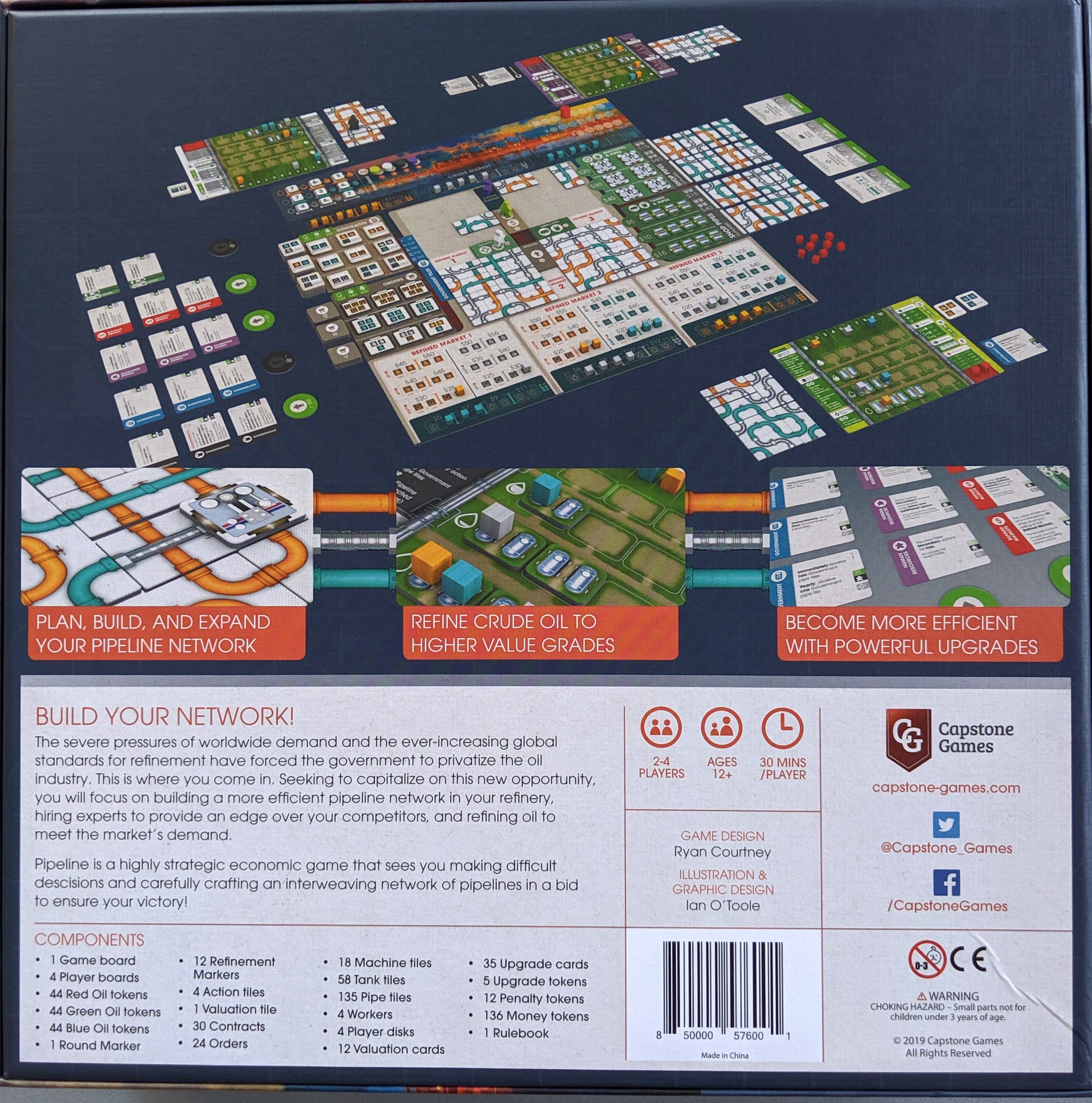
The back isn’t as breathtaking as the cover artwork, but it still does a great job of conveying how the game looks while set up, what the main themes are, and a good amount of background info to set the scene of how the game will play out.

Once the box lid is removed, the edges of the interior box display some nice pipe artwork, similar to the tiles inside the game.
Rulebook
The rulebook features the same beautiful cover image as the box, and is printed only in English.

I think that the rulebook does a great job at conveying everything in quite a small number of pages as this game can come across as quite complex.
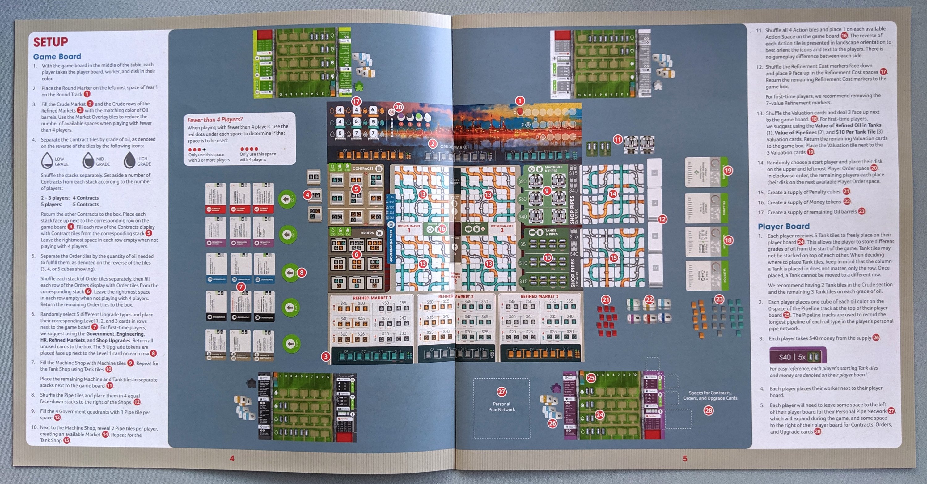
Each page is laid out really clearly, with plenty of easy to follow reference images and examples. The set up page is amazing to look at, showing the very lenghty set up in easy to follow steps. However, I did find some text instructions a touch confusing when it referenced certain bits being used/getting returned to the box, whether I was following the instruction correctly.

The gameplay examples and clear imagery are found throughout the whole rulebook, making each action in the game really clear and easy to learn.
The graphic design in this game really shines and I hope it can be used as an example for other publishers moving forward how crucial clear, simple graphics can be for heavier-weight games to make learning them more approachable.
Components
So. Much. Cardboard.
This game came with so many punchboards. The photo below doesn’t do it justice at just how many bits of cardboard there are.

All of the cardboard components are finished in a matte linen texture and they are all a nice thickness to hold. It was all super easy to punch out, but it did take quite a while to punch and sort.

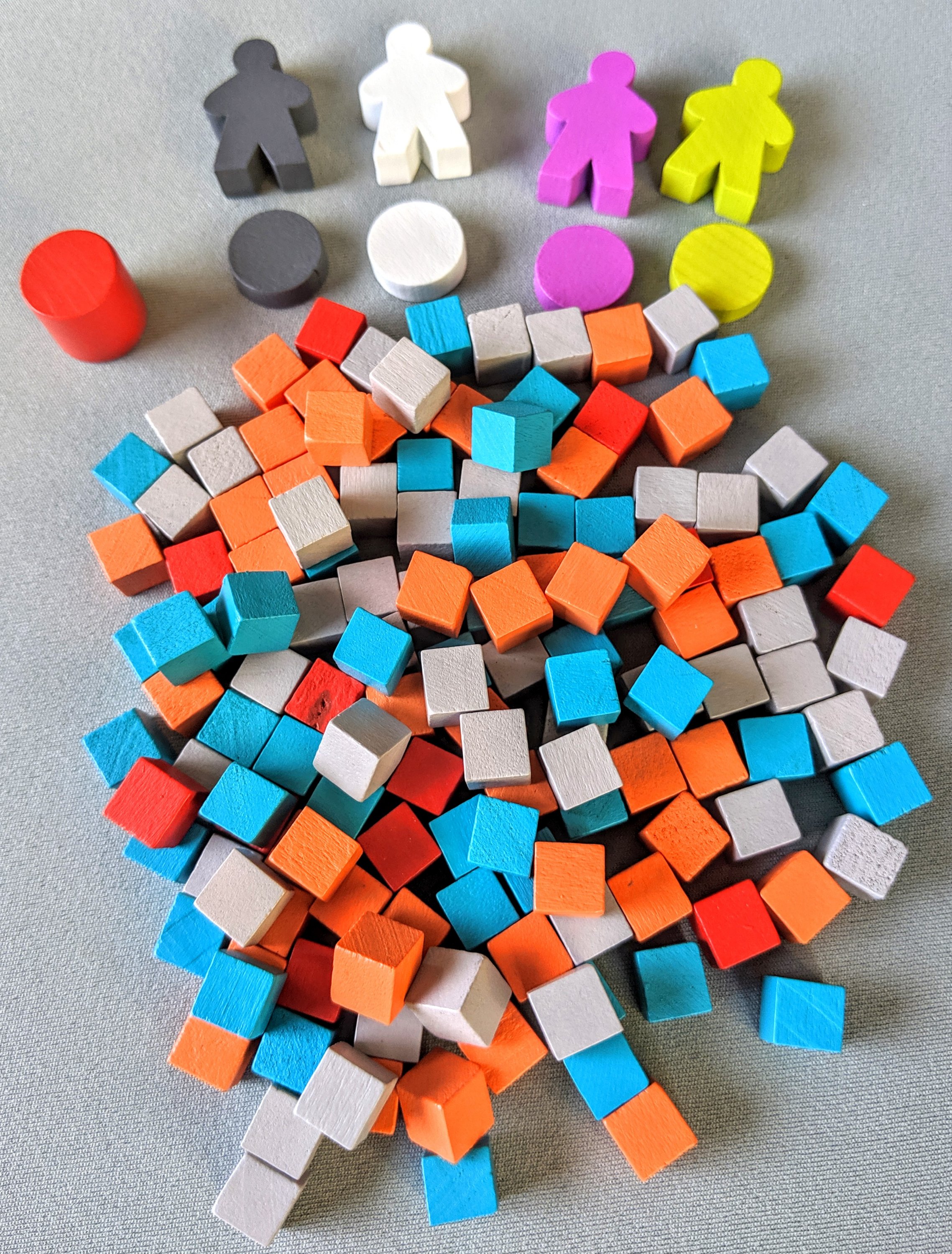
Each of the players just has a meeple and a player token, which are pretty basic but are totally fine. The oil cubes are what could have been upgraded to metal cubes instead of wood during the Kickstarter campaign, but this is not a necessity at all.
The cards feature fabulous graphic design and they are super eye catching and easy to read. As with all the tokens, the cards are also all printed on nice, thick linen cardstock.
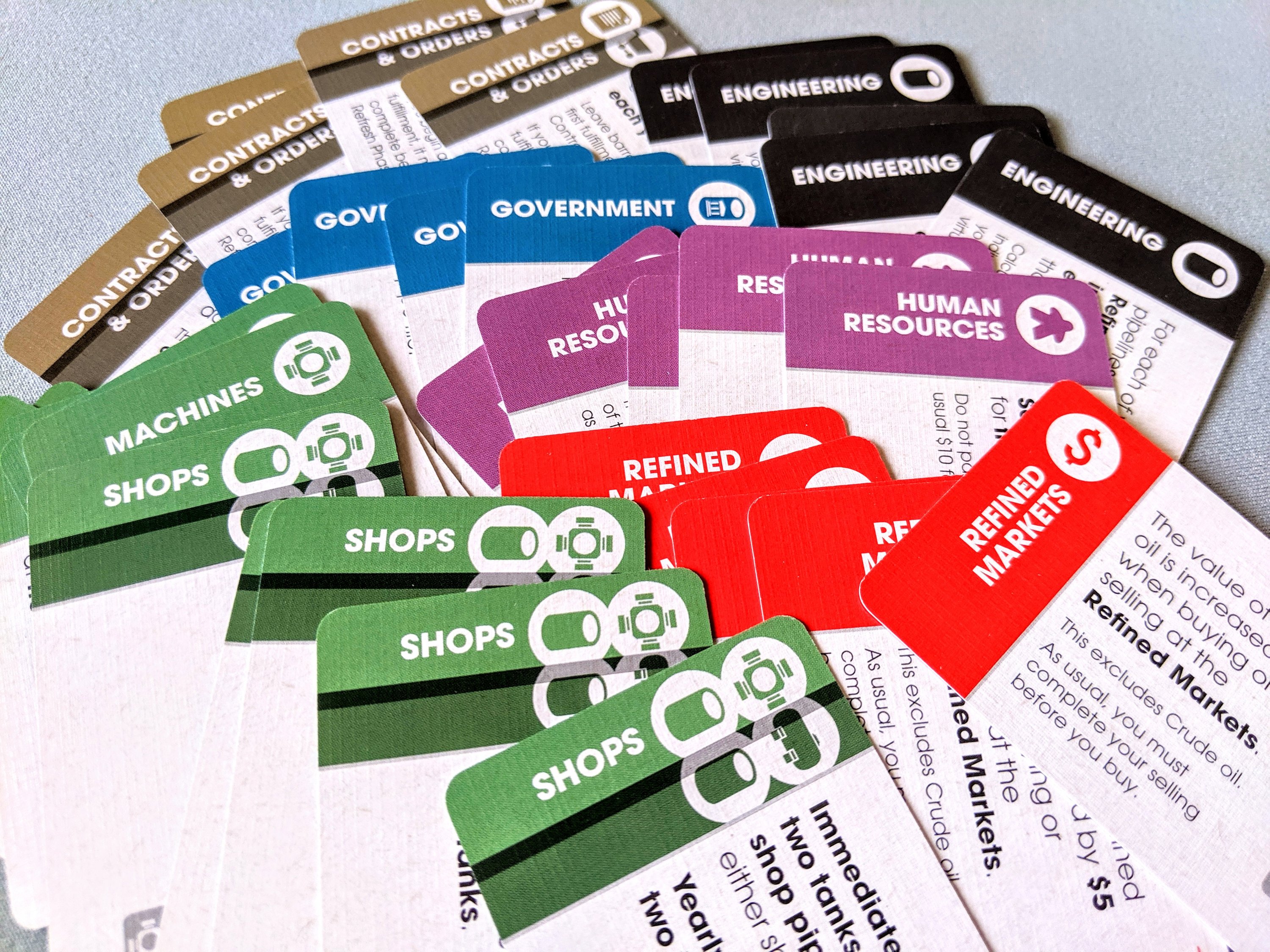
The image below shows exactly how textured each card is, and I love it! They feel really nice, and the font and text is super easy to read still.

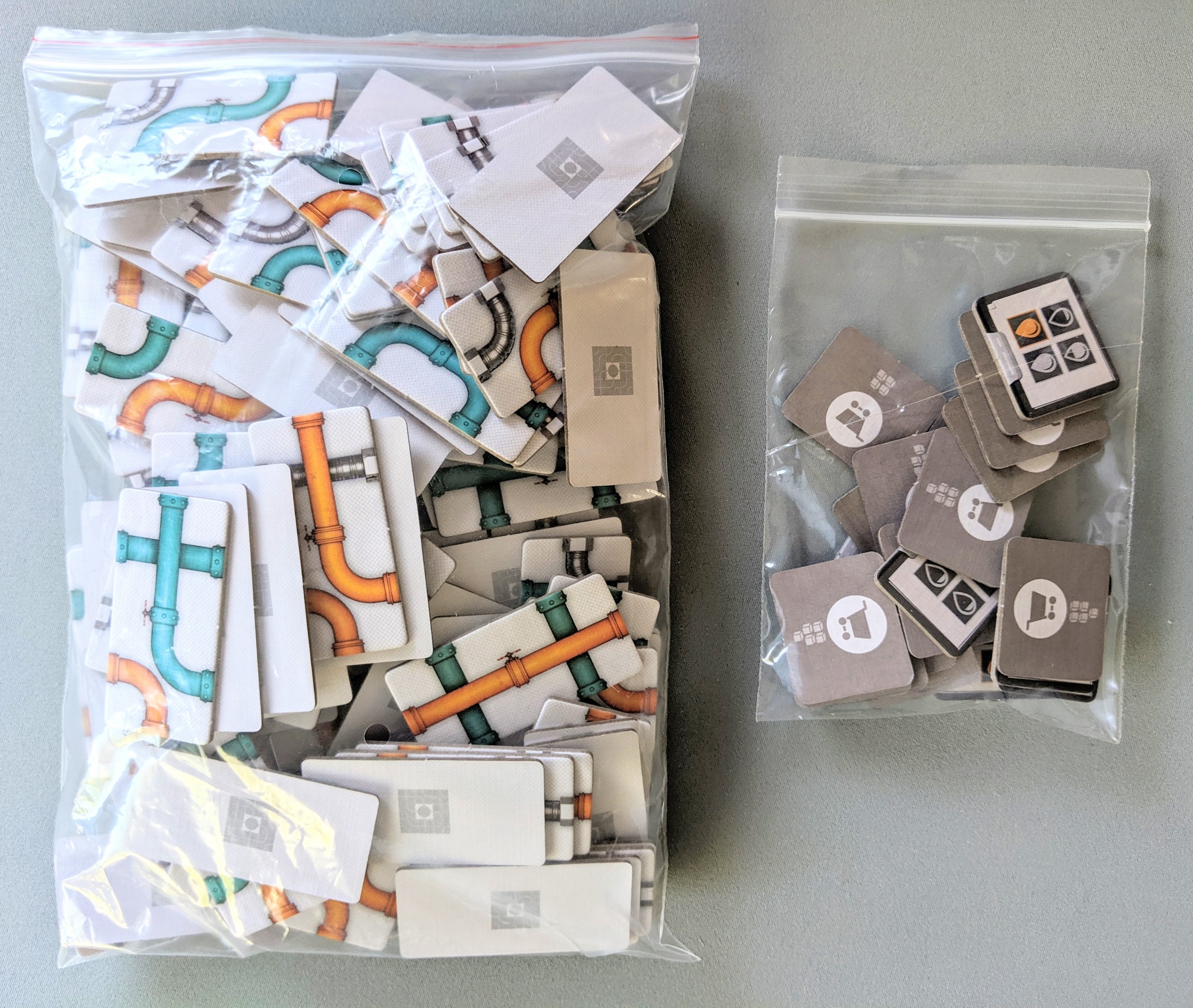
The game also comes with a bunch of baggies which are always handy, however I have a slight complaint – see below.

By the time you separate stuff into individual bags, which you need to do as there is no insert, you are left with 1 or 2 of their small provided bags to fit ALL of the pipe tiles into. This is simply impossible. Seems a weird oversight to not provide a big bag. Do people just throw them straight into the box to float around? I have found a giant bag to store mine in (shown on the left, with the provided bag size on the right), but it made me quite confused as to how to pack it all away.
Board
The game board can seem quite intimidating when it is full of tokens, but I think the designer’s have done a wonderful job at laying everything out clearly while still showcasing the amazing art style of the game. Everything is neatly displayed in a grid-like fashion, differentiated in various shades depending on the action space.
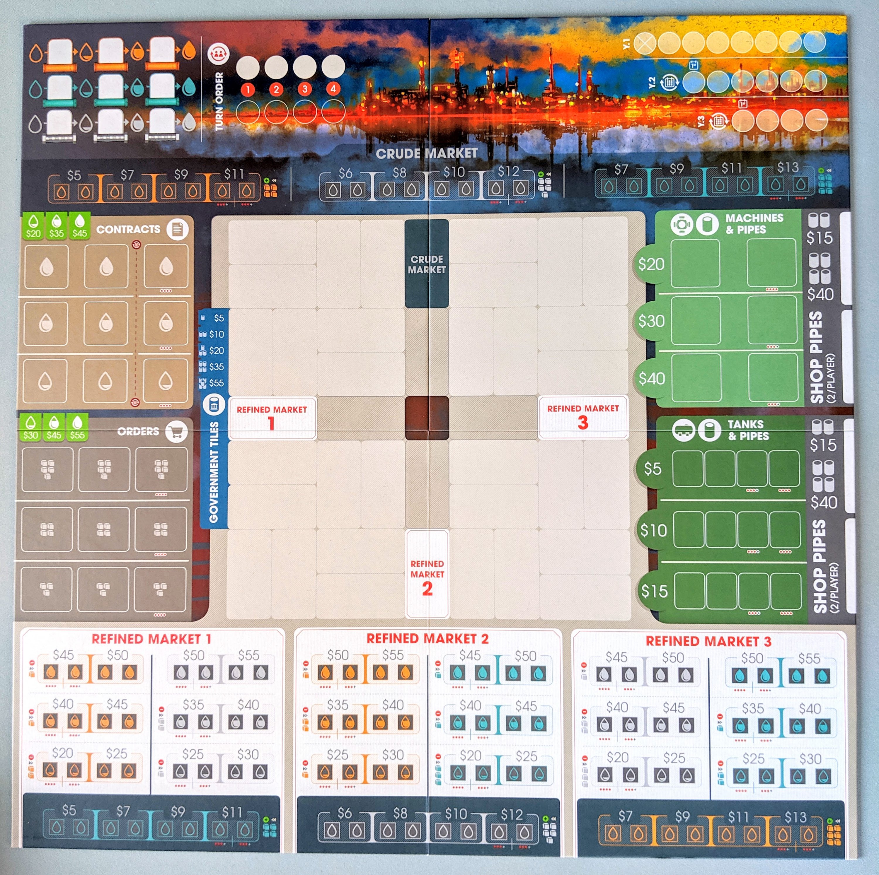
The game board is pretty big, and with every player also needing their own player board and space for their pipes, this game can spread out very quickly across the table. One issue which may present itself could also be the white ink. I know it is not ideal to use white in printing as it can be hard for people with vision impairment, especially in small font such as what is on the individual player boards.

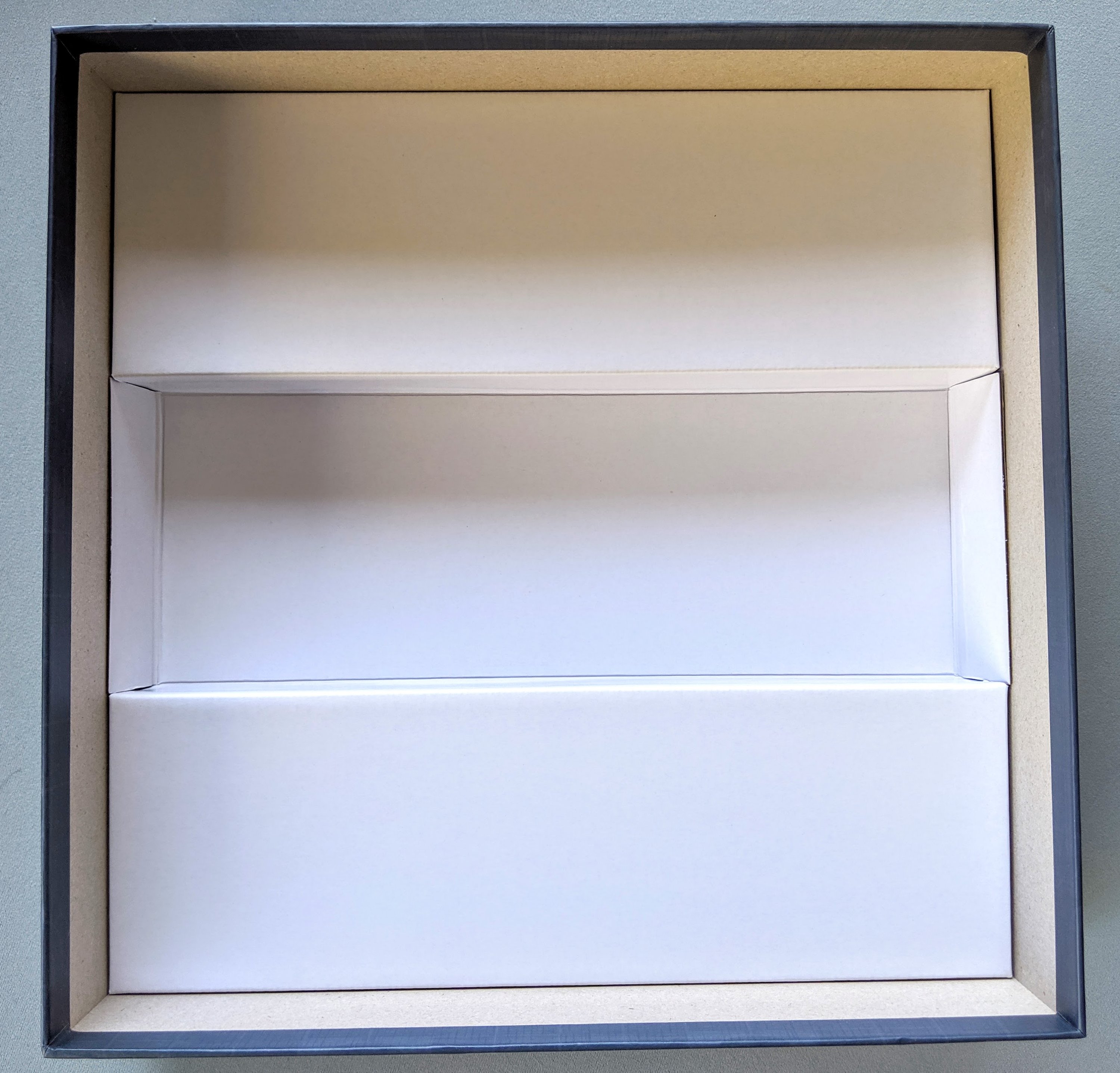
Insert
No insert. Just bags. Which is fine, but I did end up taking out the supplied bit of cardboard as I thought it was wasting space.
Here is everything thrown back into the box after the initial sorting. I will likely change how it is set up after the next play as the set up took so long, I want to try minimize that somehow, if I can.

Thoughts
Overall, the quality of this game is great, especially for a first time designer. A lot of care has gone into the graphics and it really pays off. Everything is minimalistic, clear and really high quality.
My only complaint is the bag issue I mentioned previously, but this is an easy fix for the consumer.
I would really love to make a nice insert for this to tackle the set up time/storage issue, but I will wait to see what some other people suggest as the best fix for this.
