
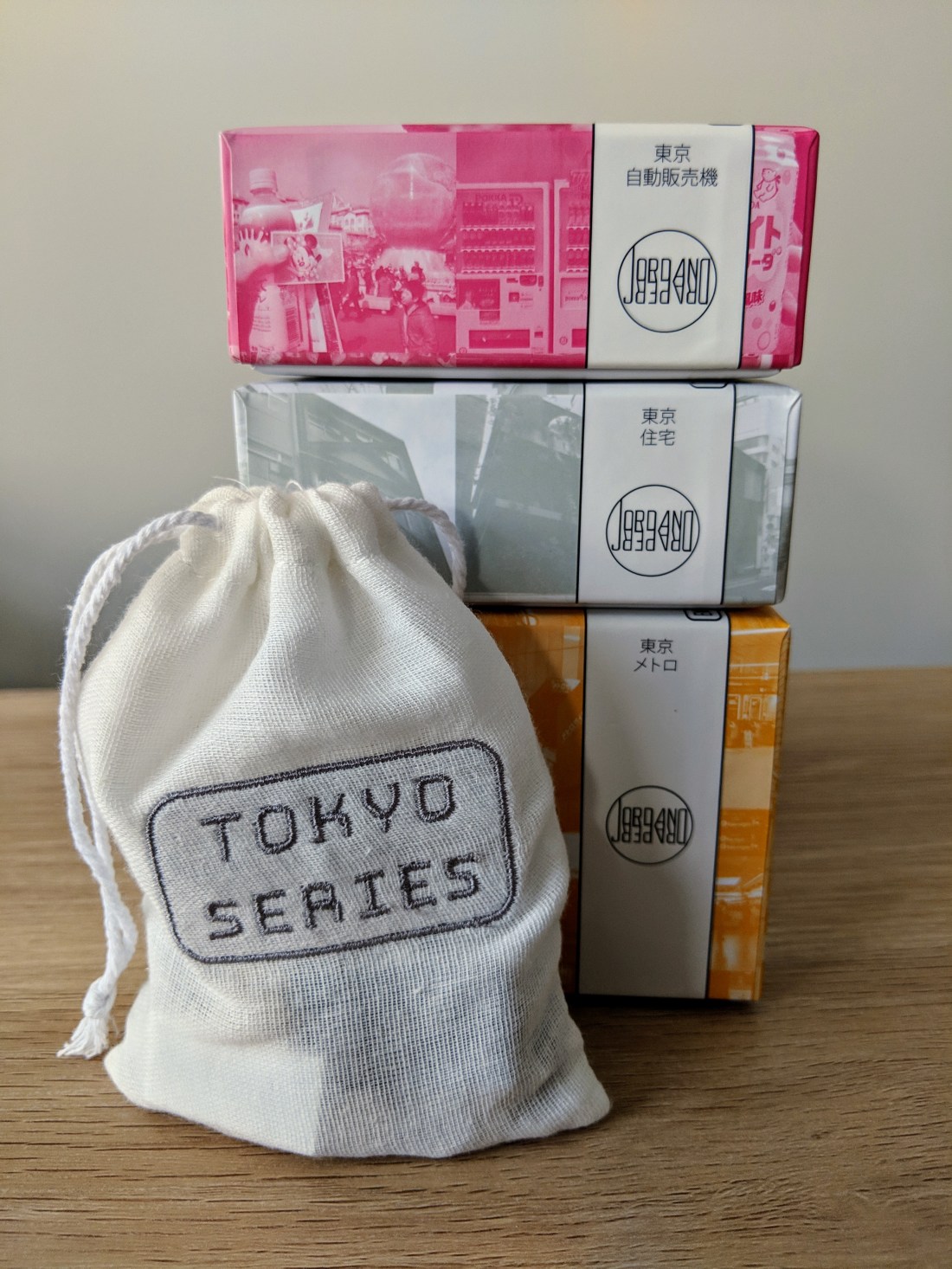
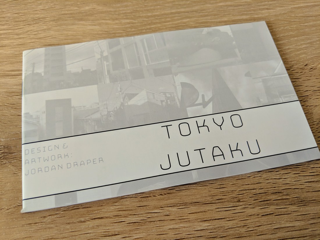
Following on from my previous unboxing is the next game in the Tokyo Series by designer Jordan Draper – Tokyo Jutaku! Players become emerging architects in Tokyo, fighting in real time to build the most successful designs, whilst still abiding by strict building requirements.
1-8 Players | 10 – 30 Minutes | Designed by Jordan Draper
Box Design
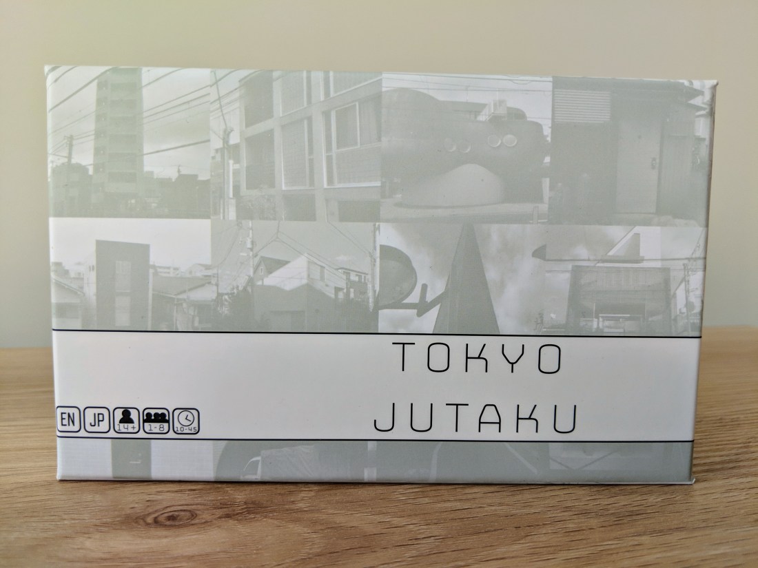
As was the case with Tokyo Jidohanbaiki, Tokyo Jutaku comes in the same small sized box and carries through the same theme and graphic design as well. The title block has spot UV coating, making it really stand out in the light.
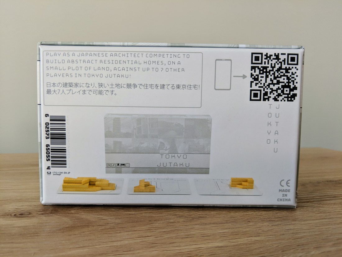
The back contains exactly the same layout as Tokyo Jidohanbaiki, and shows a few of the components which hint at what the gameplay will be like. Again, the black parts are very jarring in comparison to the minimalist grey, but overall the look is still simple and elegant.
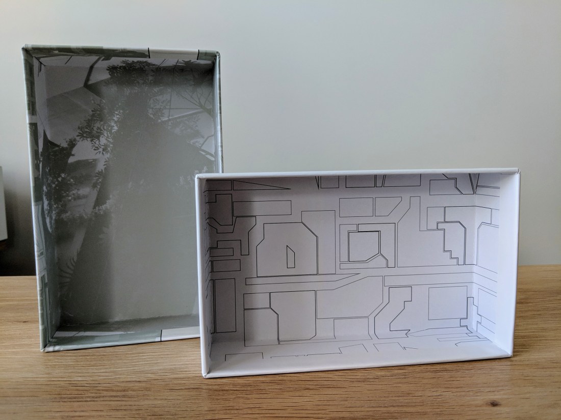
Once inside the box, you can see a greyscale image in the lid, which is a little hard to make out exactly what it is. As it serves no purpose, it is fine, but it would have been nice to see a nice building in a lighter shade where you can actually make out some of it’s architectural features. The bottom of the box shows simple city lines which match the rest of the graphic design throughout the game very well.
Rulebook
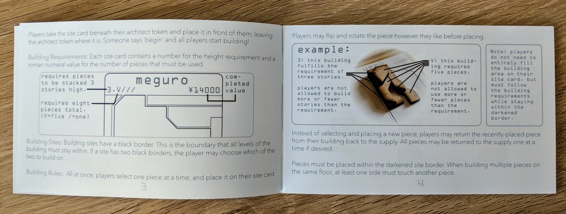
The rulebook for Tokyo Jutaku is a great size and just fits snuggly into the top of the box. It showcases the cover art again, which I think is fine for a smaller game with minimal artwork.
Each page is filled with clear information and the text is broken up well with clear diagrams and explanations. As with Tokyo Jidohanbaiki, half of the rulebook is in English, and half in Japanese.
Components
The components in Tokyo Jutaku include beautifully cut wooden shapes, and a stack of cards. That’s it.
Minimal. Elegant.

The player discs contain tastefully simplified portraits of Japanese architects printed on them, and they are finished with a smooth gloss coating. I was worried about the edges of the wooden pieces arriving with burnt edges, but they are all cut really nicely without any markings.
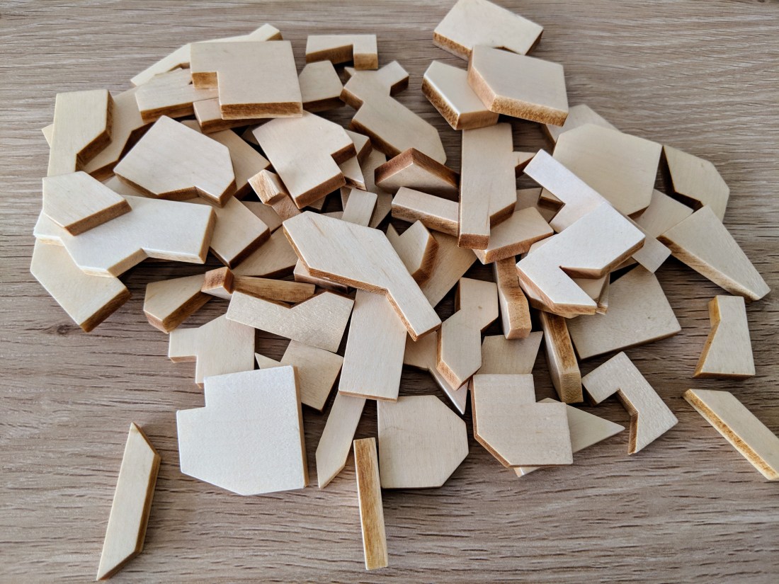
Each of the wooden shapes feels great, and they are sized really nicely to be able to grab them quickly. I think the coating will assist during the rushed dexterity elements of the game as they don’t feel overly slippery, which is a plus.
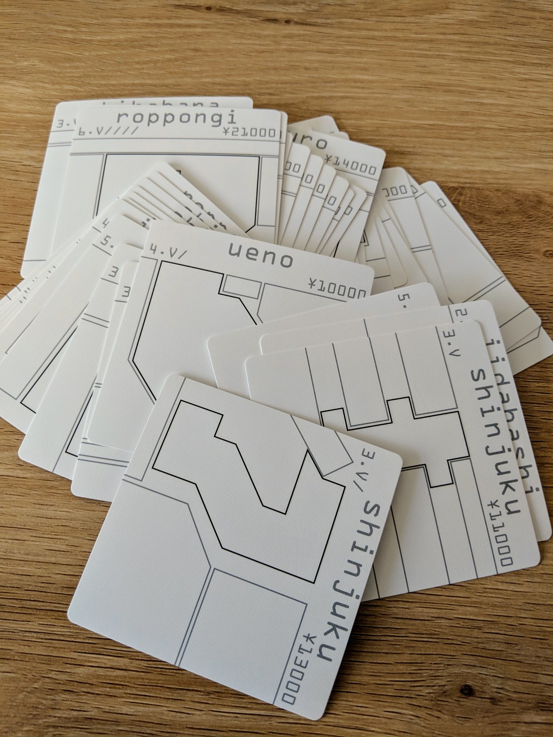
The site cards contain simple greyscale artwork, which matches the refined theme of the game. They do not require colour or shading and each of them is very clear to read. The cards all have a nice linen finish, rounded corners and double sided printing on a sturdy cardstock.
Insert
No insert is required, and you don’t even need any baggies! Everything just goes straight back into the box, and fits tightly – almost too tightly, in there.
Availability
The version I have unboxed is from Kickstarter, however there is no difference in this version vs what you might pick up from a store. At the moment, it will be quite hard to get your hands on a copy from your FLGS, but all games are stocked on the Jordan Draper web store.
Thoughts
As I just completed my university degree in Architecture, and I am obsessed with Japan, this game ticks all my boxes. Going off just the components, I can see that this game style, graphic design and component design all match both themes of Japan and Architecture well.
The refined graphics show a real sophistication and attention to detail that can be missing from a lot of newer games. A game might have amazing art, or amazing components, or overproduction, rather than focusing on restraint, and minimalism.
What I like about what I am seeing from Jordan Draper is a focus on gameplay, and a few quality components, rather than including a million unnecessary upgrades or exclusives. I am definitely keen to see the rest of the games released in the Tokyo Series, and in other Material based projects in 2019.

One thought on “Tokyo Jutaku Unboxing”